WEGO
capstone project (2017)
LEAD UX RESEARCHER AND DESIGNER

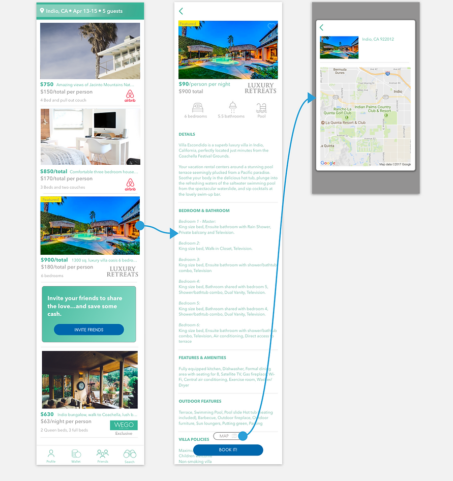
SEARCH RESULTS
ACCOMMODATIONS
MAP OVERLAY


THE CHALLENGE
Develop an iOS app that improves how groups arrange and purchase travel.
BACKGROUND
The group travel industry is growing and will surpass $200 billion in the next five years as millennials are taking more vacations with others and have more disposable income. Given the growth in the group travel industry and the tech savvy of Millenials develop an app that can capitalize on the growth of the group travel market segment in the U.S.
CUSTOMER DISCOVERY
I conducted initial in-person customer and market research to determine pain points and drive the initial phase.
REFINING THE VISION
After synthesizing the initial customer discovery we redefined and narrowed the vision for the app. New vision: Provide a seamless way for groups to arranged, communicate, purchase, and pay for travel.
INTRODUCING WEGO
WEGO is a unique and powerful iOS app that provides groups the tools to arrange, communicate, purchase, and pay for travel like never before.
How we got there
DECIPHERING THE RESEARCH
I spearheaded a research plan to gain deeper qualitative insight into the pain‐points of group travel and to look for opportunities to solve those challenges through design. Over a two‐week period, I conducted dozens of 1-on-1 interviews. To disseminate and portray the research, I created a customer journey map. This allowed me to identify and communicate the severity of the pain‐points. In this case, I literally did a back of the napkin sketch. My journey map was later featured on the UXpressia design website.
KEY FINDINGS
The journey maps highlighted two main findings. One, prioritize getting individual price point ranges in order to get the best search results. Two, develop a quick an easy way to receive and send payments in the app.
LOW FIDELITY WIRES
In the early stages, I focused on representing the main navigation and the most important areas to solve the problems of the end users. To do this I designed low fidelity wires in Sketch so I could get buy in before jumping into high-fidelity concepts.
STYLE TILE
After the basic wires were worked out I created a basic style tile to bring life into the design. After psychological and color theory research was conducted, a style tile was developed to highlight our design principles: Connective, discovery, seamless, and clean.
HIGH FIDELITY WIRES
I developed high fidelity wires in Sketch as the next step to bring the WEGO project to life.
HIGH FIDELITY PROTOTYPE AND USER RESEARCH
I pieced together high fidelity wires and build a prototype with Sketch, Craft, and InVision for user testing. I spearheaded a user research plan to gain deeper qualitative insight into the product pain‐points and to look for opportunities to evolve the product. Users overwhelmingly preferred the total cost per person highlighted instead of per night and wanted a total price more clearly identified.
Reflections
WHAT I LEARNED
Don't assume anything. Have empathy for the user. Test, don't overthink. Always focus on your main objective. Don't get too attached to your designs. Embrace and enjoy the process.

We prioritized getting individual price point ranges and an easy way to "nudge" friends to receive payment.


MONEY SLIDER
NUDGE BUTTON


BEFORE
AFTER
Users overwhelmingly preferred the total cost per person instead of per night and wanted a total price more clearly identified.
Users found the "You added a new travel buddy!" overlay unnecessary.
insight 1
insight 2


